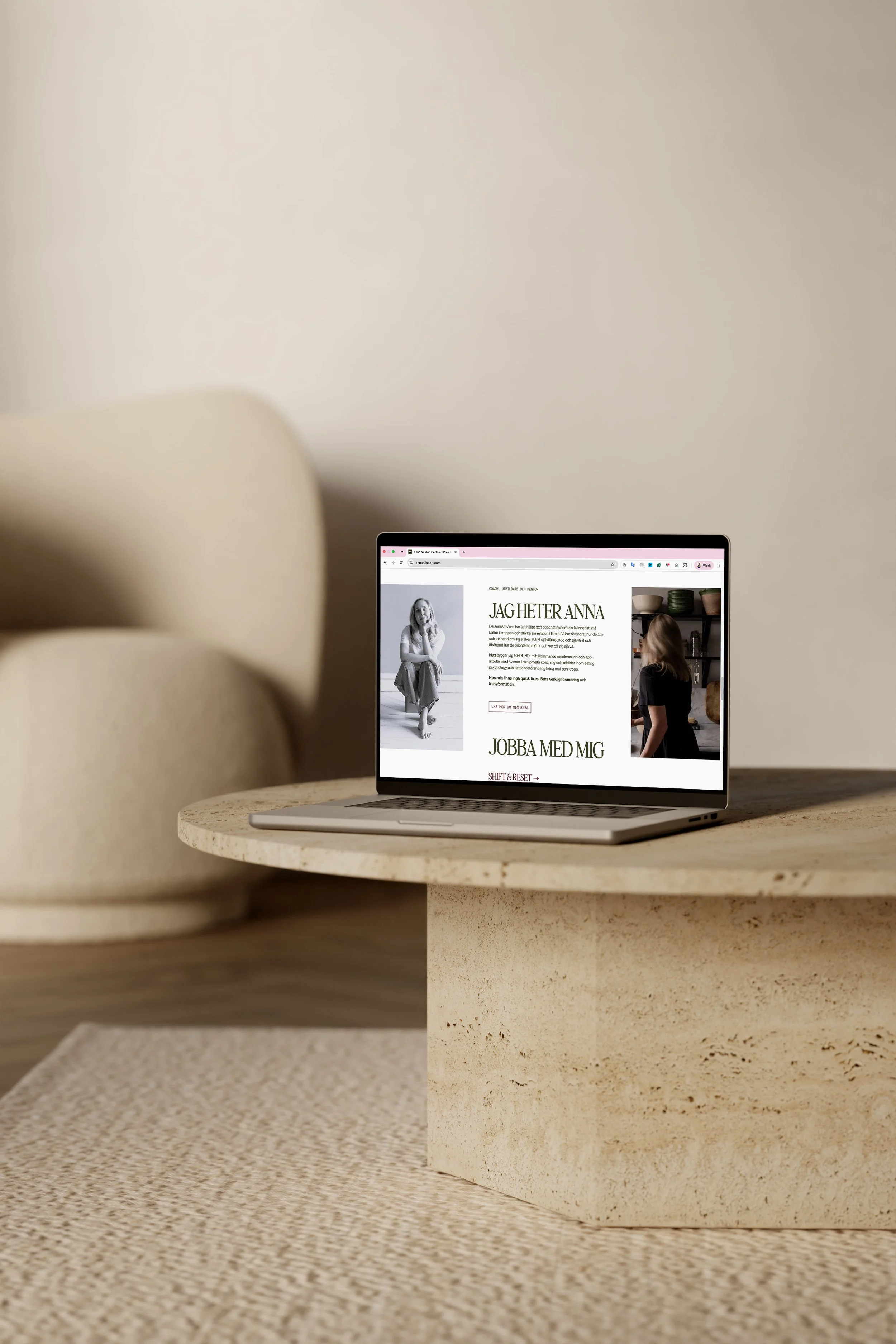
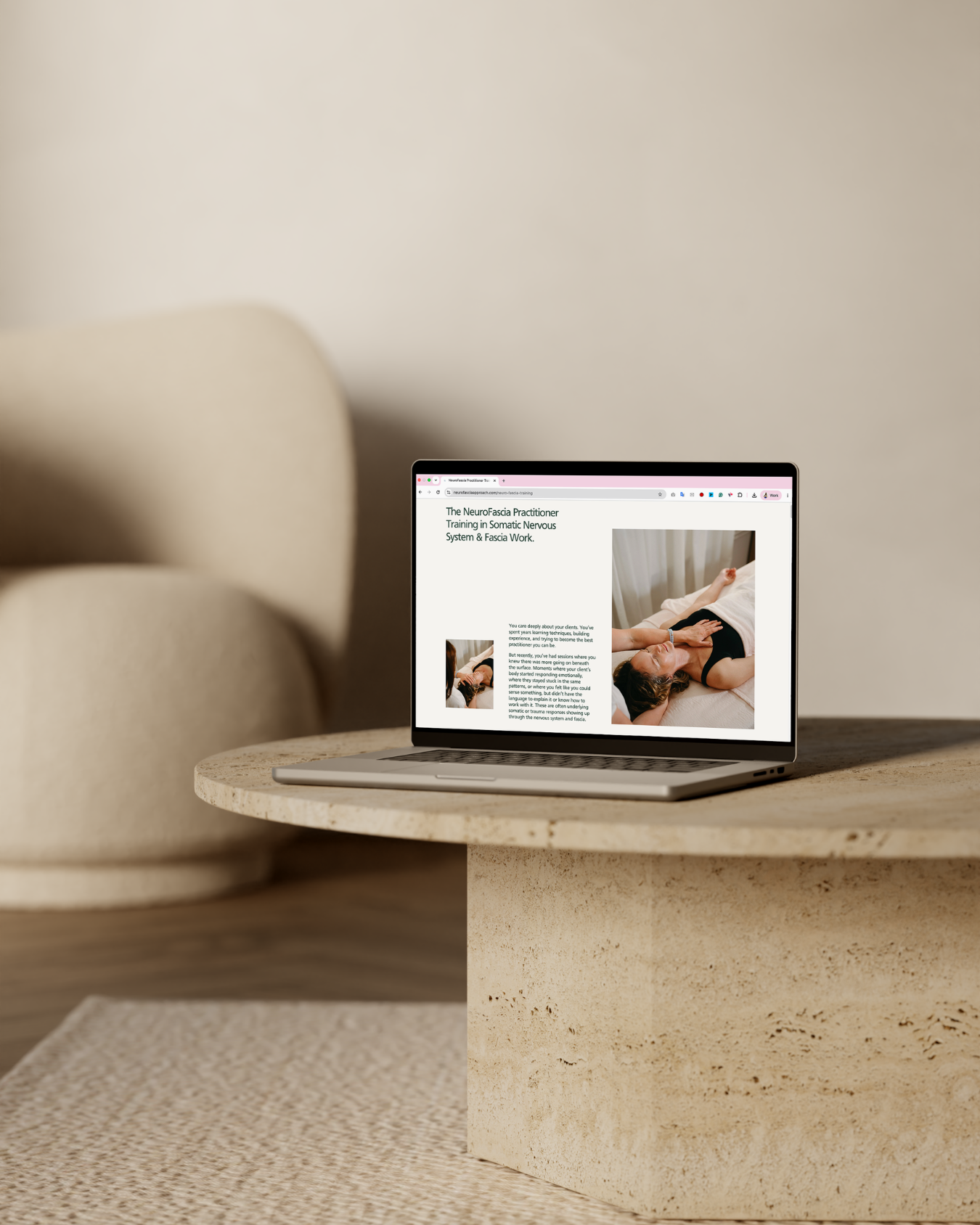
6 Branding Mistakes That Make Coaches Harder to Choose Online
When people think about branding, they often go straight to the visual bits… the colours, fonts, logo, website layout. You know… the overall “look” of the business.
And obviously, all of that matters. I am a brand and website designer, so I will never be the person telling you visuals are irrelevant. A beautiful, polished online presence can absolutely help you build trust, feel more confident, and make your business look more established.
But a brand that only looks nice is not enough. Especially when you are a coach or service provider and a big part of why someone chooses the business is you, your expertise, your personality, your point of view, your process, your reputation, and the way you see the problem.
This is where a lot of branding starts to fall a bit flat. I don’t mean because it looks bad, but because it doesn’t make enough of a case for why someone should choose you. Your website might be pretty. Your colours might be lovely. Your Instagram might look consistent. But if people still don’t really understand what you do, why it matters, why your approach is different, or why they should trust you specifically, your brand isn’t doing enough of the work.
Here are the branding mistakes I see most often with coaches and service providers, and what to do instead.
1. Looking and sounding like everyone else in your space
This is such a common one, and honestly, I get how it happens. When you’re trying to look professional online, it’s very easy to look around at what other people in your industry are doing and assume that’s what “great” looks like. Then before you know it, your website is using the same soft colour palette, the same vague phrases, the same kind of brand photos, and the same polished-but-not-very-specific language as everyone else. And the problem is, if your brand could belong to almost anyone in your niche, it’s not giving people much to remember you by.
For coaches and service providers, standing out doesn’t mean being loud for the sake of it. It doesn’t mean inventing a dramatic hot take or trying to be wildly different just to prove a point. It means making your specific way of working, thinking, and communicating easier to see.
Your potential clients aren’t just looking for someone who offers coaching, therapy, strategy, support or whatever your service is. They’re looking for the person they trust to help them with the problem they’re facing. So if your brand feels too generic, people have to work much harder to understand why you’re the right fit.
Instead of trying to look like the “right kind” of coach or service provider, your brand needs to reflect the real reasons people choose you. Your approach, your perspective, your energy, your language, your proof, and the kind of client experience you create. THAT'S what makes you easier to remember, trust, and choose.
2. Choosing visuals before you understand the strategy
I love a good Pinterest board as much as the next person, but visuals shouldn’t be the first strategic decision you make. A lot of people start with colours, fonts and logo ideas before they’ve properly worked out what their brand actually needs to communicate. They know they want it to feel calm, polished, premium, warm or professional, but they haven’t yet got clear on who they’re speaking to, what that person needs to understand or what the brand needs to help them believe.
That’s when branding becomes decoration rather than communication. Your visual identity shouldn’t just be based on what you personally like or what feels trendy right now. It should support the buying decision. It should help the right people feel something about your business before they’ve even read every word on the page.
Do they need to feel safe? Energised? Calm? Challenged? Held? Inspired? Reassured? Confident that you know what you’re doing?
Different audiences need different cues. A leadership coach, a therapist, a fractional COO and a health practitioner shouldn’t all look and sound the same, because their clients aren’t making the same kind of decision.
That’s why strategy has to come first. Before you choose the visuals, you need to understand what your brand needs to do.
Who’s landing on your website?
What are they worried about?
What are they comparing you against?
What would make them feel understood?
What would make your work feel credible?
What would help them feel safe taking the next step?
Once you know that, the design has a proper job to do.
3. Letting your brand sound nice, but not specific enough
This is probably one of the biggest things I see on coach and service provider websites. The brand sounds lovely, but it doesn’t really say enough. You know the kind of copy I mean…
“Step into your full potential.”
“Reconnect with your true self.”
“Create a life you love.”
“Feel aligned, empowered and confident.”
And look, sometimes those phrases aren’t wrong. They might genuinely be part of the transformation your work creates. But if your whole brand is built around vague language like this, people can end up not properly understanding what you do… and that’s a problem.
It sounds nice, but it doesn’t make your offer clearer. It doesn’t show the specific problem you solve. It doesn’t help someone picture what working with you actually looks like. And it doesn’t give them much reason to choose you over another coach or service provider saying basically the exact same thing.
Your brand voice shouldn’t just sound polished. It should help people feel understood. It should make the problem you solve more obvious. It should make your approach easier to grasp. It should make the invisible parts of your work feel more tangible.
That doesn’t mean your copy needs to become boring or robotic. You can need warmth, personality, and emotion in your messaging, but the language needs to be anchored in something specific and tangible. Because if someone has to get on a call with you before they properly understand what you do, your brand is probably making you carry too much of the sales conversation yourself.
Your website shouldn’t need you standing next to it saying, “What I actually mean is…” It should already be doing the explaining for you.
4. Hiding too much of the person behind the work
This is a slightly uncomfortable one, because I know putting more of yourself into your brand can feel exposing. Showing your face, sharing your perspective, writing in your actual voice, and letting people see how you think can feel awkward at first. It can feel safer to keep everything neutral and polished, especially if your work is personal, thoughtful, or rooted in your own way of seeing things.
But if you’re a big part of why clients choose the business, hiding too much of yourself isn’t protecting you. It’s just making you harder to choose. People don’t need your entire life story before they enquire. Your website doesn’t need to become a diary. But they do need enough of you to feel there’s a real person behind the work.
They need to sense your approach.
They need to understand what you believe.
They need to see your face.
They need to hear your language.
They need to feel why working with you would be different from working with someone else who offers something similar.
This matters even more for coaches and service providers because the work is often built on trust. Someone might be looking at several people who all seem qualified, experienced, and helpful. The thing that helps them choose is often the more human layer. Who feels like they understand me? Who feels credible? Who feels safe? Who feels like the right fit? Your brand needs to make that easier for them.
5. Treating proof like an afterthought
Proof is such a big part of your brand, but it’s often the bit people forget to properly build in. They spend ages thinking about the colours, the fonts, the logo, the layout and the overall feel, but the actual reasons someone should trust them are either hidden away, lightly mentioned or left until the very bottom of the page.
And I get it. Talking about your own credibility can feel weird. You don’t want to sound like you’re showing off. You don’t want to plaster “look how good I am” all over your website. You don’t want the whole thing to feel too salesy. But proof doesn’t have to feel loud. It just needs to be easy to see.
If you have testimonials, client results, years of experience, training, podcast features, case studies, client feedback, before-and-after stories, or even really specific reasons people come to you, those things shouldn’t be treated like bonus information. They are part of what helps someone feel safe choosing you.
When someone lands on your website, they’re usually trying to work out, “Can I trust this person? Do they understand what I need? Have they helped people like me before? Does this feel worth the investment?” Your proof helps answer those questions.
So instead of hiding it all on one testimonials page and hoping people find it, build it into the brand experience. Put relevant testimonials near the offer you’re talking about. Use client language throughout your copy. Show the kinds of problems you’ve helped people solve. Make your credibility visible in a way that feels natural and reassuring.
The point isn’t to make your brand feel braggy. It’s to stop making people search for the reasons they can trust you.
6. Making the next step too vague
A brand can look beautiful, the messaging can be strong, the proof can be there, and then the whole thing can still lose people because the next step isn’t clear. This happens when the call to action is too hidden, too soft or too vague. It also happens when there are too many options and no obvious path through them.
People shouldn’t have to work out how to work with you. They shouldn’t have to click around five different pages, decode your offer suite, or wonder whether they’re “allowed” to enquire yet.
Your website needs to make the next step feel simple… the journey should feel considered. If someone is ready to take action, they should know exactly where to go. If they’re not ready yet, there should still be a clear way to move closer, whether that’s taking a quiz, downloading a freebie, reading a relevant blog post or joining your email list.
Conversion isn’t about being pushy, it’s about removing unnecessary friction. When someone already feels interested, your website shouldn’t make them work harder than they need to.
Your brand should make you easier to trust, remember and choose
Your brand isn’t just there to make your business look nice. It should help people understand what you do, feel the value of your work, trust your expertise, remember why you’re different, and know what to do next. That’s what makes the difference between a brand that looks professional and a brand that actually supports your business.
And if you’re an established coach or service provider, this matters even more. You may already have clients, offers, experience, and results, but if your online presence still reflects an older or less clear version of the business, it can quietly hold you back.
You end up relying on referrals to do the trust-building. You explain too much on calls. You hesitate before sending your website link. You feel like your content has to keep proving your expertise because your website isn’t really making the case for you.
If your website looks fine on the surface, but you have a feeling it isn’t really helping people understand, trust or enquire, take my Free Website Audit, Are You The Obvious Choice Online? It’ll help you see where your online presence is already doing its job, and where it might be making the buying decision harder than it needs to be.
And if you already know your brand and website no longer reflect the level of work you’re doing now, Web in a Week is my focused done-for-you process where we bring together your positioning, messaging, branding and Squarespace website so your online presence finally makes you easier to trust, remember and choose.
Work with me
→ Web in a Week - done-for-you positioning, branding, website copy + Squarespace design for when your online presence has fallen behind the level of your business.
→ Ongoing Marketing Partnership - long-term done-for-you strategic + creative support across content, email, website updates, launches + more, for when marketing keeps getting pushed aside.