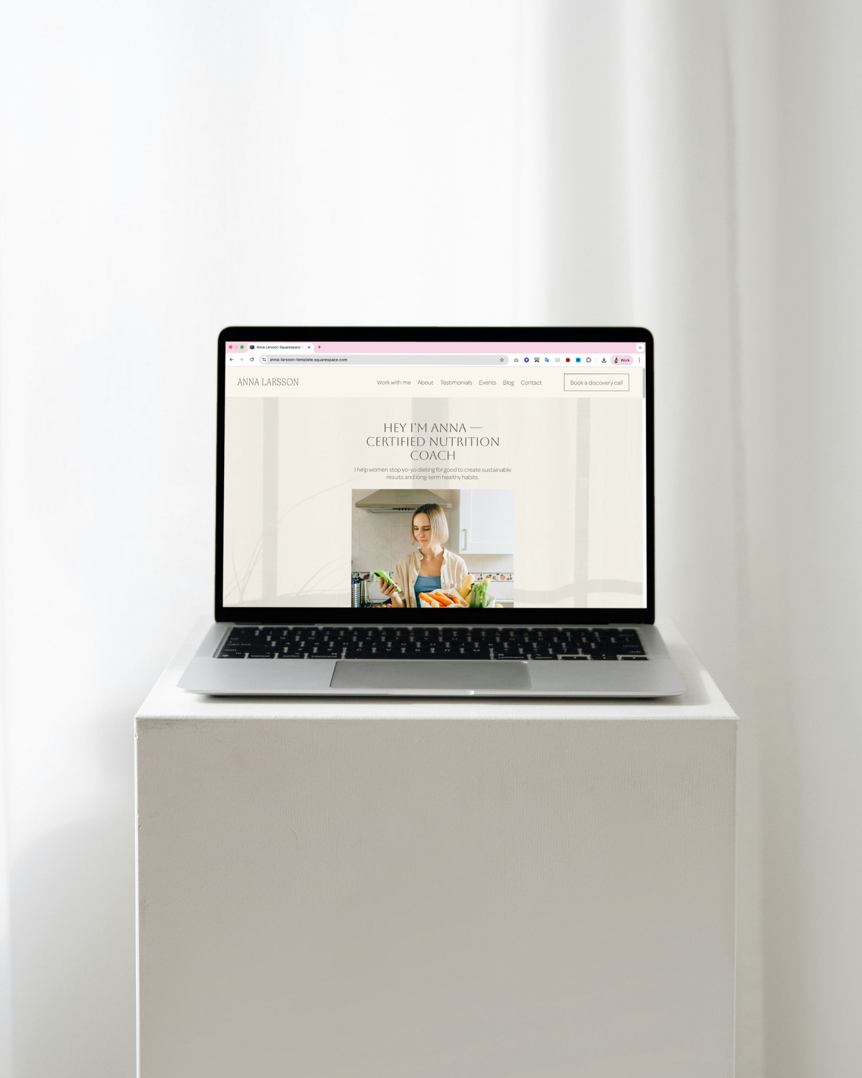
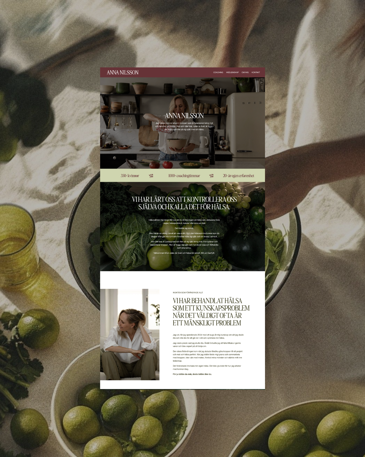
Your homepage is probably the hardest-working page on your entire website. It needs to take somebody who may know very little about you and help them quickly understand what you do, whether it’s relevant to them, why they should trust you, and what they should do next.
Quite a lot for one page!
And yet, when I review coaching websites, I often see homepages that have been built around what the coach wanted to say about themself rather than what the potential client actually needs to understand.
A nice photo.
A little introduction.
A list of services.
A button to book a call.
Technically, everything is there. Strategically... there’s often a lot missing.
When I structure a homepage for a coach or service provider, there are eight sections I want to think about.

1. The Hero
Your hero is the first section someone sees when they land on the page. Its job is not to be clever. Its job is to help the right person quickly understand that they’re in the right place.
At minimum, I want to get a sense of who you help, what you help them with, and the kind of result you help create.
Compare: “Helping ambitious leaders unlock their potential”
with: “Leadership coaching for women stepping into senior roles who want to speak up with confidence, set clearer boundaries + stop overthinking”
The second one gives me something to recognise.That matters because before somebody can decide whether they want to work with you, they first need to understand that what you do is relevant to the problem they are actually experiencing.
2. The Trust Strip
Once somebody understands what you do, the next question is usually some version of: why should I believe you? A trust strip gives them a quick answer.
Depending on your business, this might include years of experience, number of clients supported, recognisable organisations you’ve worked with, qualifications, awards, press or another relevant credibility marker.
Keep it simple. The goal isn’t to dump your entire CV onto the homepage. It’s to give the visitor an early signal that you know what you’re doing.
3. Problem to Possibility
Now you can go deeper into what your potential client is actually experiencing. What is happening in their life, career or business right now? What are they frustrated by? What have they already tried? And what do they actually want instead?
This section is where specificity becomes incredibly important. If your copy could apply equally well to 10,000 other people, it’s unlikely to create much recognition.
Use the language your clients use on discovery calls. Describe what the problem looks like in their real life rather than relying on vague phrases like “feeling stuck” or “wanting more”. Then help them picture what could be different with your support.
4. Why This Approach
By this point, somebody may understand the problem + want the result. Now they need to understand why your way of getting them there makes sense.
You might explain your philosophy, methodology, process or a key belief behind your work. You do not need to invent a complicated trademarked framework simply to sound different. The goal is to help the reader understand how you think.
Why do you approach the problem this way?
What do you believe needs to happen for real change?
What do you do differently from the obvious alternatives?
This is one of the places where your actual expertise should start to become very visible.
5. Ways to Work With You
Eventually, somebody needs to know what they can actually buy. But your homepage doesn’t need to contain every tiny detail of every offer.
You want to give people enough information to understand the main ways you can help, who each option is for + the result it is designed to create. Then let the individual service pages do the heavier lifting. If you have several offers, think carefully about hierarchy.
Which one matters most commercially?
Which one is most relevant to the majority of visitors?
Do not give every offer identical visual weight simply because they all exist.
6. The Receipts
If you make an important claim, show me the evidence. Testimonials are useful, but the strongest proof goes beyond:
“Sarah was amazing. Highly recommend!”
Look for testimonials or case studies that demonstrate an actual CHANGE.
What problem did the client have?
What changed?
What result did they experience?
If you have specific figures, client outcomes, relevant credentials, or years of experience, those can all help too.
And don't only put your amazing testimonials on a separate testimonials page. Use proof throughout the homepage at the points where somebody is most likely to need reassurance.
7. The Final Call to Action
Once somebody has reached the bottom of the page, you have hopefully done quite a lot of convincing. Don’t make them hunt around for what to do next!
Your final call to action should be clear, specific, and aligned with the main goal of the website. That might be booking a discovery call, exploring a particular offer or applying to work with you.
You can also have a secondary next step for someone who isn’t ready yet, such as joining your email list or downloading a useful resource.
The important thing is that there is a clear hierarchy. Twenty-seven competing buttons rarely make a website easier to use.
8. The Strategic Footer
Yes, even the footer has a job. It’s the final thing someone sees on every page of your website, which makes it a valuable little bit of website real estate.
At minimum, make sure it contains useful navigation, contact information, legal links and anything else somebody may need to quickly find.
Depending on your business, it can also reinforce your main call to action, encourage email sign-ups or provide another trust signal. Do not treat it as the place where random links go to die!
Your homepage should help somebody make a decision
The goal of your homepage isn’t to tell somebody absolutely every little detail about you and your business. It’s to give the right person the information they need, in the right order, to keep moving forward.
They should gradually understand:
this is relevant to me
she understands the problem
I want the result she’s describing
I trust that she knows what she’s doing
I can see why her approach makes sense
I know what I can do next
That’s what makes a homepage strategic rather than simply look good..
Want to build yours properly?
If you know your homepage needs work but you’re currently staring at Squarespace wondering what the hell should actually go where, I’ve made something specifically for you!
“How to Build a Homepage That Makes You the Obvious Choice” walks you through all eight sections in much more detail, including what to put in each one + how to think about the messaging behind it.
You can work through the whole thing in a few hours and use it to rebuild or strengthen your own homepage.
And it’s currently only €40!
Work with me
→ Web in a Week - done-for-you positioning, branding, website copy + Squarespace design for when your online presence has fallen behind the level of your business.
→ Ongoing Marketing Partnership - long-term done-for-you strategic + creative support across content, email, website updates, launches + more, for when marketing keeps getting pushed aside.