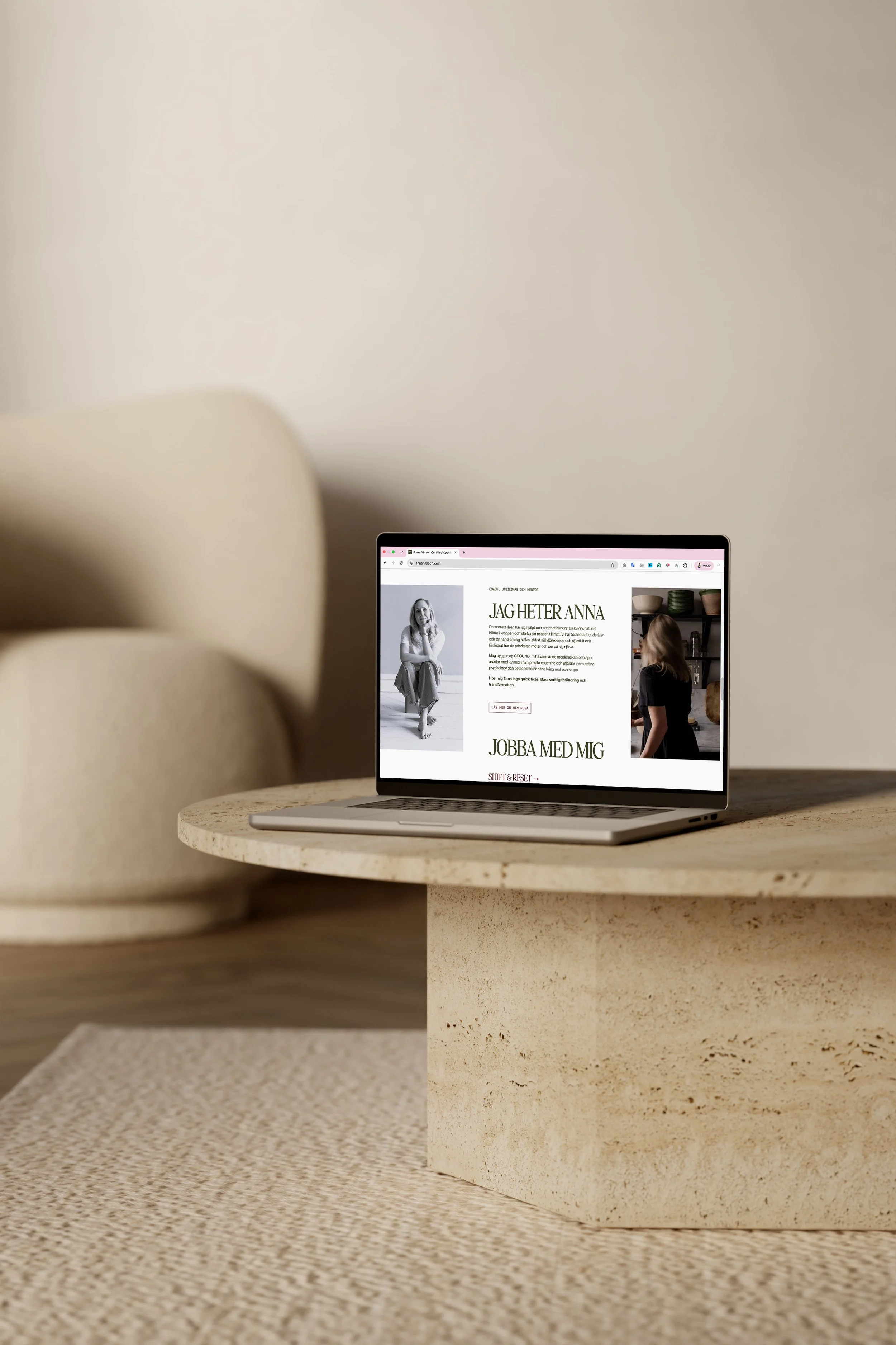
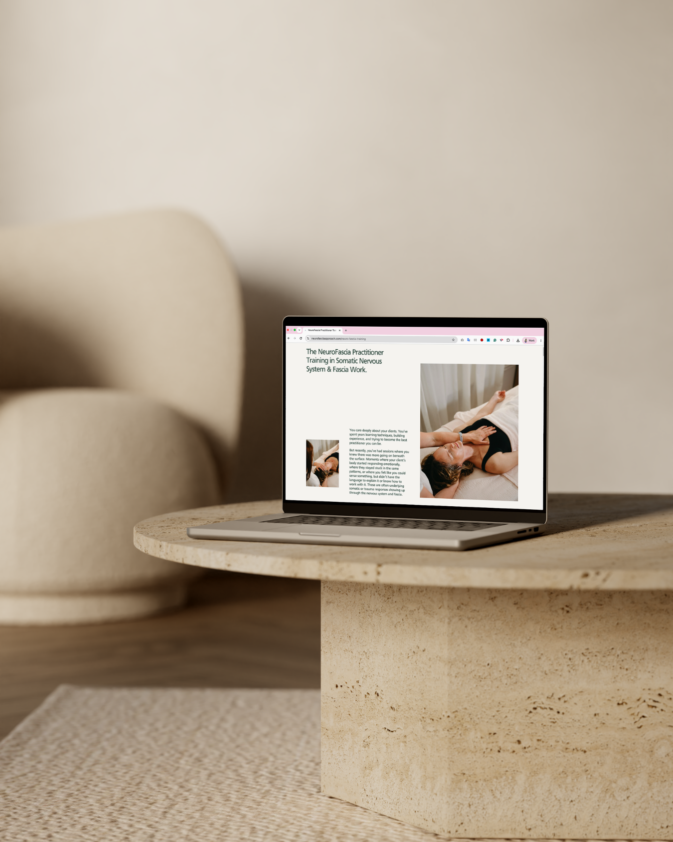
Why Your Website Needs to Show the Person Behind Your Service
When you sell a service, people are not only buying what you do. They are buying the way you do it. This is especially true if you are a coach, consultant, therapist, practitioner or any kind of service provider where your work is deeply connected to your expertise, perspective, process, and relationship with the client. Your offer matters, of course. So do your skills, and your results matter. But people are also trying to work out something much more human: do I trust this person enough to take the next step?
That is why your website cannot only be polished. It needs to feel personal, strategic and specific enough for the right people to understand why they should choose you.
A professional-looking website can still fall flat if the person behind the work is almost invisible. It might have nice colours, a clean layout and perfectly acceptable copy, but if someone leaves without a sense of how you think, what you believe, why your approach is different or what it might feel like to work with you, the website is not doing enough.
Your personality is not separate from your strategy
There is a strange idea that showing personality makes a business less professional. I see it differently. For a coaching or service-based business, your personality is often part of the strategy. Not in a performative way. More in the sense that your way of thinking, speaking, explaining, challenging and supporting people helps the right clients decide whether you are the person they want to work with.
Someone choosing a coach or therapist is not only asking, “Does this person have the right qualifications?” They are also asking, “Do I feel understood by them?”“Do I trust the way they explain this?” “Do I like their approach?” “Do they seem like someone I would feel safe being honest with?” “Do they understand the nuance of my problem?”
Someone choosing a consultant or service provider is not only about “Can this person deliver the work?” They are also asking, “Do they see what I can’t see?” “Do I trust their judgement?” “Do they have a point of view?” “Will they make easily solve my problem?”
These questions are not always conscious, but they shape the buying decision. And so your website needs to answer them. That doesn’t mean your website needs to be wildly overpersonal or share every tiny detail of your life. It simply means the person behind the work should be visible enough for trust to begin.
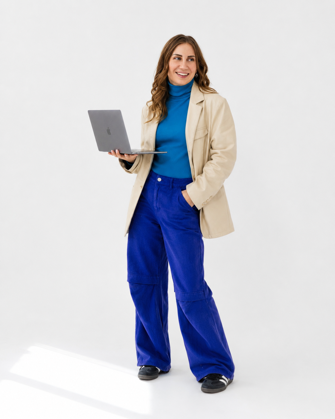
Generic websites create generic trust
One of the biggest problems I see with coach and service provider websites is that they are often trying so hard to look professional that they end up looking like everyone else.
The language becomes vague. The imagery becomes generic. The About page becomes a polished CV rather than a useful trust-building section. The methodology is either hidden completely or explained in a way that feels detached from the client’s actual problem. The proof exists, but it is tucked away instead of being woven into the buying journey. And often, the face behind the business barely appears.
This creates a problem because people cannot choose what they cannot clearly understand, remember or trust. If your website could belong to almost anyone in your industry, the right people have very little to hold onto. They may think you seem nice. They may think the site looks good. They may even believe you are probably good at what you do. But “probably” is a weak place to leave a potential client.
Your website should give people stronger reasons than that. It should show what makes your approach different, make your experience feel relevant, help people understand how your method solves their problem, use proof in a way that reduces hesitation, and give them a sense of the human they would be working with.
Trust is built through proof, perspective and presence
When I look at a website through my Obvious Choice Framework, one of the key pillars is trust.
Trust is not built by simply saying you are experienced, client-centred or passionate about what you do. Most people say some version of that. Trust is built when your website gives people evidence. That evidence can come through testimonials, client results, case studies, authority signals, your process, your story, your methodology and the way you explain the problem. It can also come through your face, your tone of voice, your behind-the-scenes thinking and the moments where your perspective becomes clear.
For example, a generic services page might explain what is included in a coaching package. A stronger services page helps someone understand why that offer exists, what problem it solves, who it is for, what makes the approach different, what proof supports it and what the next step looks like.
A generic About page might list credentials and personal facts. A stronger About page connects your experience to the client’s decision. It helps them understand why you see the problem the way you do, why your work has evolved in this direction and why they can trust you with the thing they are trying to change.
A generic homepage might say what you do. A stronger homepage helps the right person recognise themselves, understand your value and feel pulled towards the next step.
This is the difference between a website that explains and a website that positions.
People do not want overly polished as much as they want real
There will always be a place for beautiful design. I am a brand and website designer, so obviously I am not about to pretend visuals do not matter… of course they do!
But polish alone is not enough. In fact, overly polished websites can sometimes create distance. If everything feels too generic, too perfect, or too disconnected from the real person behind the work, it can make the business feel harder to trust, not easier.
People want to see the genuine you. They want to understand your thought process. They want to see your face. They want to know what you care about. They want to feel your approach before they commit to a conversation.
Your personality should support the buying decision. Your stories should help people understand your perspective. Your methodology should make your value easier to trust. Your proof should make the next step feel safer. Your visuals should reflect the level of your work without making the business feel cold or faceless.
The goal is not to become more visible for the sake of it. The goal is to become easier to choose.
What to look for on your own website
If you are a coach or service provider and you have a feeling your website is not quite capturing the depth of your work, start by looking at where you might be hiding.
Does your homepage make it clear who you help and what problem you solve, or does it stay broad because you are trying not to exclude anyone?
Does your About page help people trust your perspective, or does it simply list your credentials?
Can people see your face and get a sense of your personality, or does the website rely too heavily on generic stock images?
Do your service pages explain why your approach works, or do they only list what is included?
Is your proof easy to find and connected to the parts of the buying decision where people might feel unsure?
Can someone understand why they should choose you, specifically, instead of another coach or service provider with a similar offer?
If your website is not showing enough of your point of view, personality, methodology and proof, it may be quietly making you harder to trust. you.
Your website should make you easier to choose
Your website does not need to show every part of you. It does not need to explain every thought you have ever had. It does not need to become loud, overly personal or performative.
But it does need to show enough of the real person behind the work for the right clients to feel something click. They should understand what you do. They should trust your expertise. They should see why your approach is different. They should feel guided towards the next step.
That is what it means to become the obvious choice online.
And if your current website feels too generic, too vague, too polished-but-empty or simply not representative of the level you are operating at now, that is worth paying attention to. Your online presence might not need more decoration. It might need more YOU.
Work with me
→ Web in a Week - done-for-you positioning, branding, website copy + Squarespace design for when your online presence has fallen behind the level of your business.
→ Ongoing Marketing Partnership - long-term done-for-you strategic + creative support across content, email, website updates, launches + more, for when marketing keeps getting pushed aside.